> For the complete documentation index, see [llms.txt](https://docs.zigpoll.com/llms.txt). Markdown versions of documentation pages are available by appending `.md` to page URLs; this page is available as [Markdown](https://docs.zigpoll.com/questions/types-of-questions.md).
# Types of Questions
Learn about all the different types of questions at your disposal.
There are currently 26 types of questions. Each type behaves differently and was built to help you collect the right data from your customers and site visitors.
All of the options allow you to enter a Title, Subtitle, and Body Copy.
The rest of this doc dives into each type of question, how it can be used, and an example picture. We recommend hopping into Zigpoll's free plan and experimenting with different questions yourself!
#### Multiple Choice
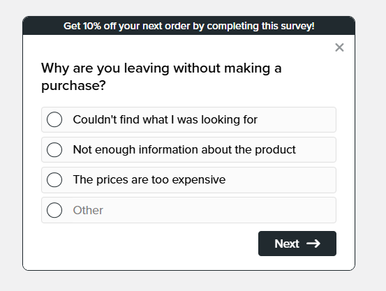
This type lets you create several answer options. Your customer can pick one or more.
Once the customer submits the answer, the results can be shown (this is optional, you can hide it if you prefer by deselecting **Show Results**). You can have as many answers as you like.
Additionally, you have the option to include a dynamic "other" answer. A dynamic answer gives the user an input box to fill in whatever they prefer. These results will show up in your dashboard so you can review them.
You can also lay the answer options out in up to **4 columns** using the **Answer Columns** setting (available on Multiple Choice and Single Choice questions).
#### Single Choice
This type lets you create several answer options. Your customer can pick one.
Once the customer submits the answer, the results can be shown (this is optional, you can hide it if you prefer by deselecting **Show Results**). You can have as many answers as you like.
Additionally, you have the option to include a dynamic "other" answer. A dynamic answer gives the user an input box to fill in whatever they prefer. These results will show up in your dashboard so you can review them and will be auto-summarized in Zigpoll Insights.
Like Multiple Choice, Single Choice supports the **Answer Columns** setting to lay options out in up to 4 columns.
#### Dropdown
A single-select question presented as a compact dropdown menu. Ideal when you have many options but want to keep the question visually small.
#### Mosaic
A multiple-choice question where the answer options render as a tiled grid directly in the question, letting respondents tap selections quickly. Great for visual, fast-moving surveys with many short options.
#### Autocomplete
A single-select question with a searchable, type-ahead input. As the respondent starts typing, the list of answer options filters down to matches.
This is ideal when you have a long list of choices — for example a product, store location, or brand — that would be unwieldy as a dropdown or a list of multiple-choice options. You can add as many options as you like, and (like Single Choice) include a dynamic "other" answer that lets respondents type in their own value.
#### Matrix
Ask several questions that share the same set of answer options, laid out as a grid: each **row** is a question and the **columns** are the shared choices. Respondents pick one option per row.
This is ideal for rating multiple items on a single, consistent scale — for example rating Shipping, Packaging, and Support each as "Poor / Okay / Great" in one compact question instead of three separate ones.
Each row is reported as its own breakdown on your dashboard, just like a Single Choice question, so there is no extra work to analyze the results. You can optionally enable **Randomize Questions** and **Randomize Answers** to shuffle the rows and columns (pin any you'd like to keep in place), and the whole question can be marked optional.
#### Short Answer
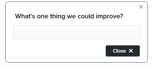
Write-in in a single line box. You can set placeholder text or fine print.
Once you have enough volume of write-ins, Zigpoll will help with summarizing themes and responses.
#### Long Answer
Write-in in a multi-line box. You can set placeholder text or fine print.
Once you have enough volume of write-ins, Zigpoll will help with summarizing themes and responses.
#### Binary choice
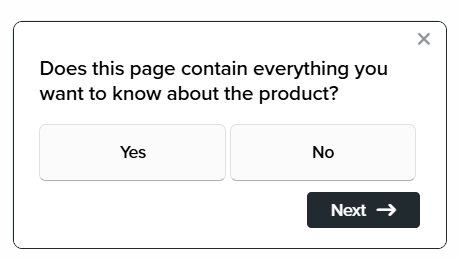
Useful if you want a "Yes/No" answer between two choices.
For example: "Are you buying this for someone else?"
#### Form Panel
A question that allows you to have multiple fields. These are best used for "contact us" or support forms.
When creating each field within a form panel, you have the option to set the type of question (email, long answer, phone number, date etc.) and whether the field is optional or required.
When filled out, the responses will be grouped together on your dashboard for convenience.
#### File Upload
File uploads let respondents upload files, and you can restrict the number of files allowed, file type, and max file size. This can be useful for wholesale use cases, support, or for custom designs!
File Upload isn't available on [Shopify POS](/installation/activating-zigpoll-on-shopify-pos.md) surveys, since the register has no file picker; it's hidden from the question picker when a survey uses a POS delivery template.
Additionally - if you would like your user to take a picture, enable the "mobile auto-capture" field. When enabled the camera will pop up on mobile devices automatically for a streamlined experience. This will limit the number of files accepted to 1 file only. Great when you're expecting photos or UGC content.
#### Image Choice
Upload a set of images to allow customer to pick from. Can upload unlimited images in theory, but best to cap it at 6.
You can control rules around how many images must be selected and how many columns of images to be displayed. (Image Choice columns are separate from the Answer Columns setting on choice questions and have no 4-column cap.)
Best used for product/design feedback or to see whether respondents remember a particular ad creative — for example, testing ad recall on channels like TV.
#### Consent
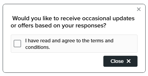
Useful if you want to opt-in users for marketing communications or Terms & Services.
#### Country
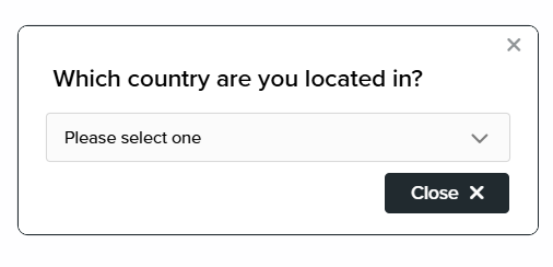
Allow respondents to select from a list of countries.
#### Date
Let respondents pick a date — useful for capturing birthdays, delivery dates, or event dates for follow-up.
#### Star Rating
This type is useful if you want to get a 1-5 rating from your customers. The UI is large, colorful, and simple to optimize engagement, and you can customize the labels.
*For example: How would you rate our support?*
Two settings control the look:
* **Type** — rate with **Stars** or **Hearts**.
* **Style** — choose from over a dozen illustrated styles: Default, Emoji, 3D, Anime, Clay, Comic Book, Crystal Glass, Hand Drawn Doodle, Holographic, Oil Painting, Origami Paper, Pixel, and Watercolor.
When a respondent picks a rating, every star up to their selection fills in — so a 4-star answer shows four filled stars, not just one.
#### Slider
Useful for a scale measurement of a metric.
You have the ability to change labels, change the increment of the slider.
If you want the slider to represent options 10,20,30... you would set increment to 10.
#### Email Capture
This will create an email capture form. The user is required to enter his or her email before proceeding with the survey.
{% hint style="info" %}
The emails will be saved to your account and can be exported into your mailing list at any time.
{% endhint %}
#### Phone Number
Collects a phone number using a specially formatted input that validates and formats the number as the respondent types. Useful for follow-up, SMS opt-ins, or support.
{% hint style="info" %}
Like email capture, collected phone numbers are saved to your account and can be exported at any time. You can also send SMS survey invitations to these numbers.
{% endhint %}
#### Range
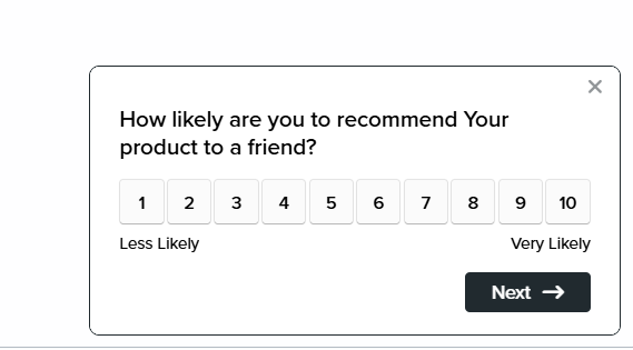
Create a list of inputs from 1-10. This type is useful if you want to do a heat check on a new feature.
*For example: How do you like our new feature from 1-5?*
#### Satisfaction
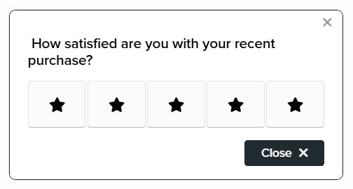
This is another useful type for capturing user feedback. It is more limited in that you only have five emotions, but it can be helpful for getting a quick reaction to a new feature.
*For example: How satisfied are you with our return policy?*
#### Promo Code
Add a question that displays a discount code!
Full tutorial below
{% content-ref url="/pages/Unv1KnjO66PubFN1WBCb" %}
[Adding discount codes to your survey](/tutorials/adding-discount-codes-to-your-survey.md)
{% endcontent-ref %}
#### Actions
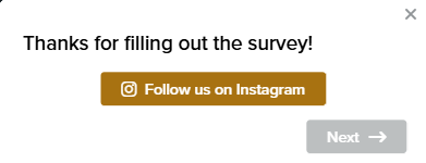
Actions were designed to send respondents to another link. This is particularly useful if you want to send them to social media platforms, another page on your site, or to leave a review.
#### Text & Image
A content-only question (no question) that displays a title, copy, and optionally an image. Use it to introduce your survey, add context between sections, or make an announcement.
#### Thank You
A closing content question shown after the survey is complete. Use it to thank respondents, set expectations for follow-up, or point them somewhere next.
{% hint style="info" %}
All responses will be saved to your dashboard and can be exported at any time.
{% endhint %}
#### Ranked Choice
Let respondents rank from a set of options. You can set the minimum number of answers you want to be ranked.
---
# Agent Instructions
This documentation is published with GitBook. GitBook is the documentation platform designed so that both humans and AI agents can read, navigate, and reason over technical content effectively. Learn more at gitbook.com.
## Querying This Documentation
If you need additional information that is not directly available in this page, you can query the documentation dynamically by asking a question.
Perform an HTTP GET request on the current page URL with the `ask` query parameter, and the optional `goal` query parameter:
```
GET https://docs.zigpoll.com/questions/types-of-questions.md?ask=&goal=
```
`ask` is the immediate question: it should be specific, self-contained, and written in natural language.
`goal` is optional and describes the broader end goal you are ultimately trying to accomplish on behalf of the user. GitBook uses it to tailor the answer towards what is most useful for that goal.
The response will contain a direct answer to the question and relevant excerpts and sources from the documentation.
Use this mechanism when the answer is not explicitly present in the current page, you need clarification or additional context, or you want to retrieve related documentation sections.